RSS
Showing posts with label Dining Rooms. Show all posts

Formal Dining Rooms


Earlier this week Cristin posted about decorating dining rooms over at Simplified Bee and it's gotten me itching to start decorating my own dining room (to get a feel for what I'm going for, see HERE). When we first moved in, we managed to paint out the trim on the lower third of the room to resemble wainscoting and paint the balance of the walls a deep blue (Farrow & Ball's Drawing Room Blue), but that's all the progress that's been made so far -- and unfortunately, until my budget recovers, that's all the progress that's going to be made for quite some time.
But that doesn't mean a girl can't day dream, right? In fact, I'd say a temporary cash crunch can be a good thing for designing a room as you're forced to window shop in favor of actually, well, shopping. This forced abstinence allows you the time to really get a feel for what you love most (rather than what you love today or what your budget allows you to buy today). And, when you finally do have the luxury of going out and buying new pieces, having curtains made, etc., you know the market, the trends and what it is you're really after.
So here are a few of my absolute favorite dining rooms, collected over the past few months as I continue to contemplate the transformation of my small dining room into something truly spectacular.


For me, a formal dining space should be exactly that: formal. It should also be luxurious, dramatic and special. After all, these rooms are for special occasions, most of them occurring at night. So I say work with that and go for lots of drama: crystal, gilt, mirrors, silks, velvets, dramatic colors, hand painted wallpapers...you get the idea. If you're looking for a good guide on how to incorporate all that and more without making the room feel overdone or too stuffy, you need look no further than Kara Mann's gorgeous gray dining room (above) that was featured in last month's Traditional Home. I particularly love the silver-leaf finish on the mantle against the Carrera marble surround.

There are those that argue that formal dining rooms are dinosaurs; that the modern family does not need to distinguish between public and private rooms, formal and informal settings. And that's certainly true to an extent, but at the same time I love the idea of the luxury of having a formal dining room. The luxury of having a place at home to celebrate truly special occasions. The type of room that is filled with memories yearound, even if it is only "used" a few times a year (though certainly there is nothing stopping you from using your formal dining room -- and your formal china -- on a regular basis, and I completely encourage this!).
In this dining room designed by Hillary Thomas, I love how the trim and wainscoting is painted out in a high gloss sage green. It's such a great way to modernize very traditional architecture (and the very traditional wallpaper). The glossy green also works well with the dining chairs, which are done in a high glass black with a sage green seat.

Wainscoting and wallpaper (especially handpainted wallpaper) are two of my favorite design elements for a formal dining room. The sea grass rug and lack of window treatments make this room feel much lighter than many of the others -- and also more approachable. For me, this room is the perfect balance between formality and luxury, on the one hand, and practicality and comfort, on the other.

A simple formula for high drama in a dining room is dark bare wood floors, metallic wallpaper and a crystal chandelier. The mirrored insets into the paneled doors is a simple and inexpensive way to add a little extra sparkle and to dress up an otherwise standard feature. I also love the Kartell Mademoiselle Chairs, with their lucite legs and low backs.


Here, I love how the dark slate walls contrast with the high impact turquoise chandelier and hot pink upholstered dining chairs. I think my first inclination would be to pair colors like this with a predominately white backdrop, but Katie demonstrates here how success dark walls with bright furnishings can be. I also like how she kept it from feeling too cave-like by having a lighter colored rug on the floor. This lightness is similarly reflected on the ceiling, which appears to be papered in a subtle tonal damask. 
Pastoral murals in dining rooms are very, very traditional. In fact, you can see many fine examples of them in homes in Pompeii. Here though, the brighter colors in the mural and in the fabrics lend a rather whimsical quality to Thad Hayes' space. So much so that it feels almost cartoon-like.
Anyone else remember Ondine from the second season of Design Star? [By the way, is that show ever coming back? I loved it!] In any case, Ondine is back and in the running for Traditional Home's Young Traditional Designer of the Year. Flipping through her portfolio, I fell in love with this dining room. I love the juxtaposition of the almost Medieval architecture with the vibrant pinks. In fact, I'd happily steal that set of Ikat chairs and the hot pink buffet for myself. How fabulous would that look against navy walls?

Nathan Egan is one of my favorite designers for subtle drama. Rooms like the dining room above show that you don't need bold colors or expensive, embroidered wallpaper to make a big impact. I also love how the oversized photograph is hung between the wall and wainscoting. The gesture feels almost haphazard, but the effect is incredibly striking. I also love the large wine barrel chandelier -- sure, it's been trendy, but there's also a nice rusticity about it that works so well with more traditional interiors.
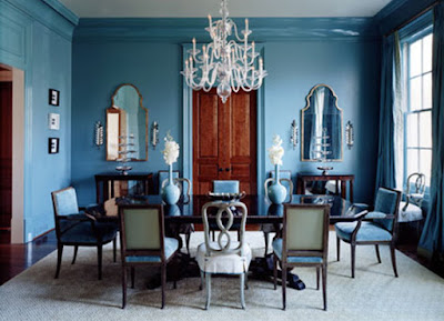

One of my all-time favorite dining rooms, by the near-faultless Suzanne Kasler. While I usually prefer trim painted-out white, the blue lacquer that Suzanne applied to both the walls and trim here is incredibly striking. I also tend to prefer matching chairs (or at least matching side chairs with a pair of larger chairs for the ends), but yet again Suzanne proves here there's no "rule" that I can come up with that can't be successfully broken.


This dining room was featured in a spread House Beautiful did last year on a beach house Annie Selke decorated and I absolutely fell in love with all of it. I love the mix of patterns here as well as the mix of blues. A deft hand is needed for this type of mixing, but Selke is skilled at mixing both patterns and colors in a way that feels very modern, without any of the eclectic-bohemian element that I'm admittedly not a huge fan of.

  • Digg
  • Del.icio.us
  • StumbleUpon
  • Reddit
  • RSS

Dining Rooms


Dining Rooms are the place to enjoy a good meal. By keeping in mind the function of this room when shopping for furniture, artwork and accessories you will be more decisive when making your decisions. Be aware of whether the items you are choosing are something you want around when eating a great hearty well cooked meal. Appetizing is key to setting your dining room. Beautiful colors, sturdy furniture and dramatic draperies make for a pleasant sensation for eating.

  • Digg
  • Del.icio.us
  • StumbleUpon
  • Reddit
  • RSS

Different Colors for Different Tastes

Different colors for different tastes. Color is such an important element in our lives. It has been a part of the natural world since the beginning of time, yet we continue to be fascinated by the mysterious nature of this subject.


Blue. Do you want to paint your room blue? If so, you´re in good company. Depending on the shade, blue relax and make us feel more spiritual and centered. Blue also calm the ambiance encourage peace, relaxation and is chosen for bedrooms for just this reason. Folk who constantly bicker should choose a rich blue in the living room. Blue improves productivity, so that might be the right choice for a kids rooms where they will be studying.

Blue seems to work less well in kitchens and dining rooms. The kitchen is a room of any home and therefore it is best to shy away from hues of purple and blue as they will slow you down when you are on the go. When blue is used in connection with food, that can have the effect of suppressing appetite, which could be a good thing for lose weight.


Blue is also considered to be a clean color, and also blue has the association with water, so it effect very well in bathrooms and laundry areas. Blue relaxes, refreshes, cools and gives out tranquil feelings. It is open and inviting when teamed with yellow, it creates the perfect beach illusion.

Red has the opposite effect of blue. It increases blood pressure and respiration rate. Red is a vibrant color and it can be dramatic. It can also create a feeling of intimacy in the bedrooms, but also can be too thought, provoking and can cause insomnia, but in combination with one or two calm colors can be great choice for bedrooms. For living rooms red color add warmth and make a atmosphere pleasant. Deep red works well. The deeper red - the more superior.


Bright red stimulates the metabolism. It is a good accent for kitchens and dining rooms however the shades of red should be applied with careful consideration because it can become claustrophobic in a small space. However, certain shades like orange-red or brown-red may be muted, they are cozy, comforting earth colors like terra cottas, brick, cinnabar.


Red is an extremely warm color choice for the bathroom. Red is a powerful color so it´s generally best used as an accent. Using red makes a powerful statement, so red furniture and accessories should be clean and in good condition. Red is a very dominant and exhilarating color, making it striking to use in the home.


Yellow It is the happiest of colors, it signifies communication, enlightenment, sunlight and spirituality. People also tend to lose their temper more often in yellow rooms. Yellow often makes many people feel cheerful, energetic, and happy. Yellow is an inspiring color. It is dazzling, dynamic and energetic. Yellow is a great color for using in living room, bedrooms, dining rooms, in fact you can use yellow almost everywhere. Yellow color can be too intensive, but in combination with some calm color it may be a good choice. Bright yellow color is positive and innovative when used in a meeting rooms.

Yellow in the kitchens and dining rooms is fine because refreshing, increases energy and inspires, helping you to concentrate your efforts on culinary delights. Yellow also frequently prompt more opinionated feelings than other color. Blue and yellow provide a seaside feeling, yellow and white provide a crisp and clean look.

Yellow in the bathroom, offers a fresh start to the morning, it can give the feeling of waking up to a sunny day, every day. The range of yellows is vast and some lend themselves more readily to decorating schemes than others. People who like it, really like it and people who don´t, tend to dislike it intensely.

Green represent a vast range of natural color and for that reason, appeal to many. Like blue, green tend to calm and relax, it´s a healing color. For interior color schemes, olive and sage greens seem to be appealing because of their neutral character. A strong green in the living room helps digestion after moving from the dining area. For bedrooms, green creates a sense of light and space, plus a feeling of tranquility.


Bright green in the kitchens and dining rooms gives a fresh and inviting look creating the sense of light, it also encourages healthy food to be conjured up. Dark greens are favored as traditional banker´s colors like burgundy,ruby, sapphire blue.


Green is a good color choice for bathrooms it rejuvenates, and promotes a sense of security, and harmony making you feel calm and restful. You have to be careful with green in the bathroom the wrong shade can make your skin appear yellow when you glance in the mirror.


Orange is warm, welcoming and vital. Melon, tangerine, and yellow-orange mango are bright, cheerful and tend to improve appetite. Orange work well in living rooms and offer an upbeat and friendly tone. Orange-red combination, where orange dominate more, warms a room but in a less dramatic and fiery way. In the bedrooms, where we are resting, oranges and reds colors can be too thought, provoking and can cause insomnia.

Used in kitchens, breakfast nooks, and dining rooms, orange shades can be very comfortable. Orange gives us a relaxed and pleasant filling when we are at the kitchen or dining room, and that is good for our mood.

Orange in bathroom refreshes and promotes good spirits creating an idyllic place for relaxing and contemplating life in the bath.


Purple Historically, purple is the color of kings. Often connotes mystery or spirituality. Purples run the range of the red-purple such as eggplant to the blue-purples of a summer sky at sunset. Violet or purple is a regal color, something we don't see a lot of in interiors. It is mostly seen in the pale form of mauve or lilac. Light purple for living rooms its good choice, give a nice and friendly filling. In the bedrooms, purple relieves insomnia and its also a good color to apply if you experience migraines or headaches.

This kitchen is big and has a modern style. Also contain a modern dining table. Here dining room is not separate room. In one word, purple is very interesting colors for the home and gives a special decorative effect. Lavender, pink-violets and magical magentas are all looking especially fresh and sophisticated today. Light purple is a relaxing color the perfect antidote for a stressful day. It is also a fun color in the bathroom, it creates space which is light, fresh and invigorating.

Pink is an interesting color because it has the cultural associations of being feminine, but it goes farther than that. Research shows that pink rooms reduce angry behavior at least temporarily. Pink is often a color we love or hate, it has that appeal. Soft and subtle it is delicate, peaceful and gentle, but bold and vibrant shocking pink can be emotional and stimulating to your senses. Generally, for living rooms pink is a comfort color, when we talk about light tone of pink. Pink is a nurturing color, represents sharing, promotes relaxation, perfect for bedrooms.

For kitchens and dining room, pink color in various tone give fresh and stylish look. The cooking can be fun. For pick this color in our interior first we must must be brave and decide that that color is the right choice. However, it can be very interesting and sometimes is good to try with something new. Pink is often underestimated and is making a big comeback teamed with chocolate brown.

In the bathroom pink create fresh space. Very light pink is a relaxing and fun color for a stressful day, but men generally have an aversion to living in a pink space, maybe they feel uncomfortable around emotional colors.

Gray tends to enhance creativity, which can make it a good color for offices and studios. Grey is also favored as an executive color and can mix well with any color. Grays on walls provide an flexible neutral background for furnishings, and can be extremely stylish and modern for living rooms. For bedrooms increased sense of sophistication and calm. Heavy use of gray usually indicates a lack of confidence and fear of exposure.


Grays can be buttoned down and traditional, modern, stylish and contemporary for kitchens and dining rooms. As a neutral, gray provides an unobtrusive background for an infinite number of color combinations.

Gray as color for interior design is known to be a color that is anti-productive. It tends to make a person withdraw, instead of move forward and is therefore not recommended for use in offices where action and a lot of energy is desired. Gray is often a drab color, it goes by unnoticed unless it gets teamed up with a color of some substance like hot pink or brilliant orange.


Brown brings warmth at home. Its also tends to be soothing and comfortable. Browns also work well with spicy or warm colors. Like grays, browns span a broad range of neutrals and, depending on the shade, are appropriate for almost any room. Dark browns are warm, calm and tranquil colors and they`re good for every room. Lighter tones such as beige and also dark tones like chocolate brown are relaxing and good for the living rooms and bedrooms.


Brown represents comfort, ease, happiness, tranquil, warmth, restful and etc. Because of that brown color is fantastic and perfect for kitchens and dining rooms in any tones. Brown usually consists of red and yellow, with a large percentage of black. Consequently, it has much of the same seriousness as black, but is warmer and softer.

Brown color its not matched up with orange, but more subtle natural tones of caramel and tan, cream and white and even with black is good combination. It even looks quite stunning beside dusky pink. Combined with unexpected colors like pale blue, or chartreuse, browns can be exciting and sophisticated. Brown has associations with the earth and the natural world.

Black give a dramatic and elegance effect, but Its not good choice for walls. Also, painting over black generally takes more than two coats of paint, which makes it a nuisance to cover later. One current trend is mixing a neutral room with some pieces of black furniture. Black used with a mix of white looks very modern in the living rooms. Black combined with red and white, it provides a very striking look and its good choice for bedrooms, kitchens or any other room.


A black granite bench top creates a look of sophistication and elegance in the kitchen. Still, the number of color combinations using black are huge. For the dining rooms we can choose black furniture elements, especially look very modern and give special effect a table with black glass. Dark colors generally make rooms seem much smaller than they are.


Black and white checked floor vinyl will always be popular for bathroom floors as it provides high contrast and provides detail to the floor of often small areas. Black is not a popular choice for wall colors as it is very enclosing and intimidating, but works well as an accent color. Is often used for light fittings, accessories and door hardware to provide a neutral color from which to work your color scheme around.


White is probably the most used color in interior design. Start with white walls and gradually build up color around it, this is the safe way to get confidence using color. Painting a room white will make the room look bigger and cleaner and can give rooms a pure and bright look. Good choice for living rooms and bedrooms in combination with any other colors, because we must be careful, using too much white can make a room too bright, and make it hard to look at.


White give impression of cleanliness and maybe that is the basic reason to pick white furniture or white walls for kitchen or dining room furniture. White reflects all light so it makes spaces appear larger and that is why it is used on ceilings.


Most ceilings are white, most bathrooms are white, probably due to the fact that everything goes with white. White gives us the impression of cleanliness and good hygiene, this is another reason why we like to use white in a bathroom.


  • Digg
  • Del.icio.us
  • StumbleUpon
  • Reddit
  • RSS

TopOfBlogs My Ping in TotalPing.com iPing-it Add to Feedage RSS Alerts Add To Fwicki Add to Spoken to You
Preview on Feedage: interior-design-minimalis Add to My Yahoo! Add to Google! Add to AOL! Add to MSN
Subscribe in NewsGator Online Add to Netvibes Subscribe in Pakeflakes Subscribe in Bloglines Add to Alesti RSS Reader
Add to Feedage.com Groups Add to Windows Live
Feedage Grade B rated
