RSS
Showing posts with label Linda's kitchen. Show all posts

This 'n that


I was interviewed for a story about working with an interior designer that appeared on The New York Times online. Thanks to Camilla McLaughlin spoke with me, Susanna Salk and others about the process of working with an interior designer and what we bring to the process of designing one's own home. Specifically, my virtual decorating service was profiled. Click here to read the entire story.  Fun!


Sad news came today that Hachette Filipacchi announced the closing of METROPOLITAN  HOME magazine. The December issue will be its last. Sadness. Ironic given the line on the cover "Comfort & Joy". Sadly, Editor-in-Chief Donna Warner and her staff will be let go. According to the press release, they will be putting all their juice into Elle Decor.  We interviewed Margaret just last week on The Skirted Roundtable and spoke with her specifically about how her thoughts on the continued success of ELLE DECOR. Very interesting. You can listen hear.  My thoughts go out to Met Home's editor-in-chief if twenty-six years Donna Warner and her staff. The streets seem paved with displaced shelter mag workers these days. 


 On the kitchen front, I have the first coat of paint on the cabinet fronts (Ben Moore's Essex Green) and ceiling (F&B's Cooking Apple Green on the ceiling and inside the cabinets - it's fantastic!!). The second coat on the cabinet fronts will be Ben Moore's Black Forest Green, with a little antiquing thrown in. The cabinet doors are all finished (yay!!) and I'm just waiting for the new knobs I've ordered to come in. Very excited to show you those!  )In case you're wondering, the soffit above the cabinets is going to be finished to match the rest of the walls in the kitchen.) The photo above shows the spaghetti dinner I cooked for Rob (my volunteer staffer is back on the job!) and I - while the paint was still wet!! Nothing like boiling water right underneath the wet paint!!

Speaking of cooking, this space is going to look a lot better with these babies:


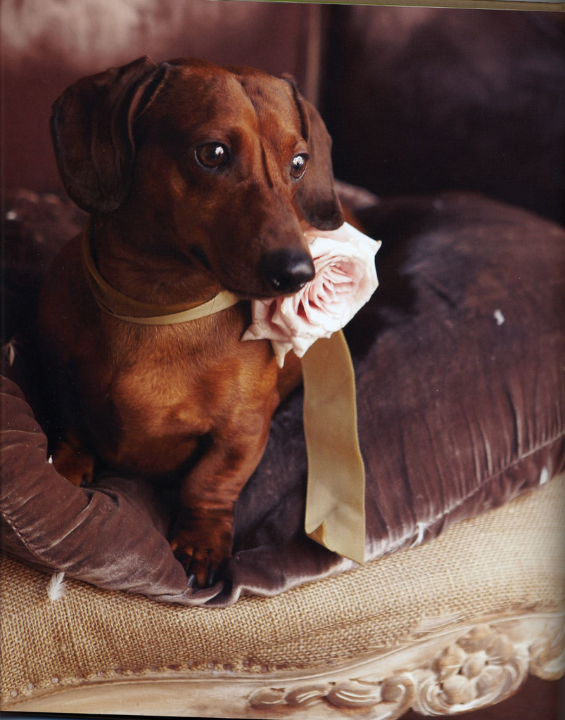
And finally, Grayson Handy, whose book FLOWERS FOR THE HOME I reviewed yesterday shared with me a couple of additioal pics of his dachsund Romeo, whom I've developed a huge crush on. So, I thought I'd share the cuteness. Photos by Ellen Silverman.


 Subscribe to ::Surroundings::


  • Digg
  • Del.icio.us
  • StumbleUpon
  • Reddit
  • RSS

Saturday afternoon: Painting, tea and reading!

So, with the time change, Saturdays are so short!  My kitchen makeover is moving slowly along and my "volunteer" staff has been AWL (absent with leave) for the last couple of weeks, so I've been on my own. I've done a lot of painting and today I finally tackled the backside of the cabinet doors. The front sides are all done (the big reveal to come soon!). With the light rapidly going away, painted (Ben Moore Black Forest Green) away outside on my back deck.


It's quite chilly today so by the time I was done, I was ready for a little pot of tea and warm apple spice bread.  I also got caught up on some reading. I've never heard of this Luxe Interiors + Design magazine, but it came in the mail today, so I flipped through that, Elle magazine and the new book Flowers for the Home by Grayson Handy. Totally gorgeous!


The nice folks at Rizzoli had sent the book several weeks ago and I've been drooling over the cover alone!


I've done some floral arranging, but I'm hampered by the complete inability to remember flower names and how they need to be treated. So, while I know what I like, I really do leave the work to the professionals. If I need an arrangement for a client or a shoot, I describe what I want in terms of color, texture and size. 

"Flowers for the Home" isn't just a picture book with pretty photos of pretty flower arrangements - although Handy's arrangements are beautiful and Ellen Silverman's photography is to die for! The book is broken down into locations that have inspired the author: China, England, France, India, Japan, Mexico, Morocco, the American South and Tropical Rainforest. He then breaks down each section into regional inspirations, a color palette, a signature arrangement (with instructions in the back of the book for how to make that arrangement - flower by flower) and a resource section.

Of course, France always inspires me.


Okay - all together now: awwwwww  (btw - Mr. Handy's dog Romeo is the spitting image of my dachsund, the late, great Tiny from my childhood).


This is an excellent book for anyone interested in floral arranging, or even just beautiful photography!


 Subscribe to ::Surroundings::


  • Digg
  • Del.icio.us
  • StumbleUpon
  • Reddit
  • RSS

Linda's Kitchen: Cabinets, Colors and Cooking


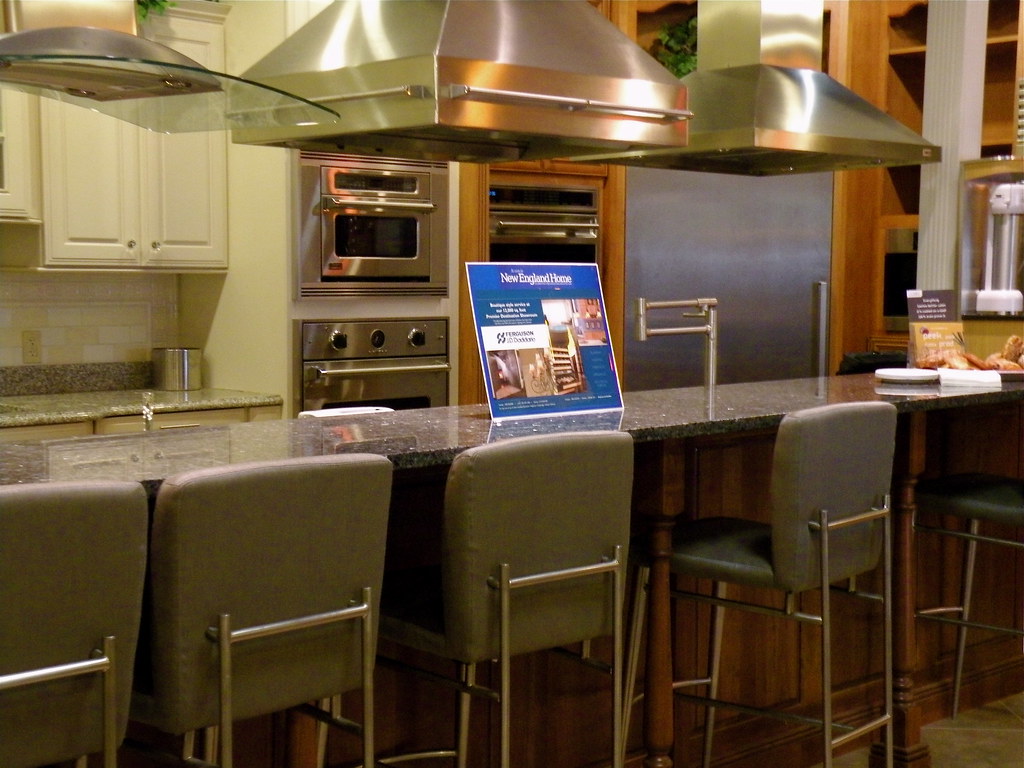
I had a great meeting with the nice folks at Ferguson's on Friday. I've never shopped for kitchen appliances for myself before and it's fun! Paul Gillis was my sales guy and we spent quite a while looking at various products and their features. My kitchen is tiny, so my appliances also need to be fairly modest.  I'll have more on that process in a future post once the final selections are made, but I wanted to share a few images from their showroom.

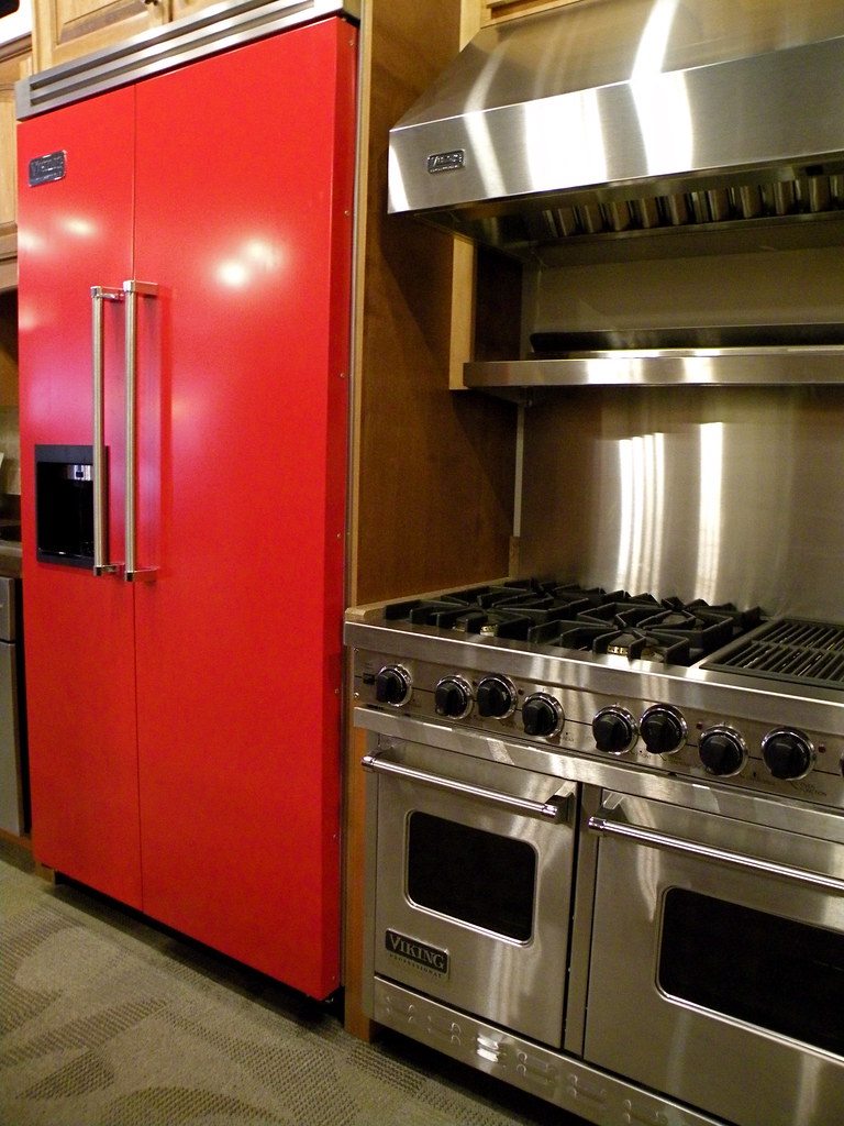
Here are some beautiful - and huge - Viking appliances. The red fridge is pretty eye catching, as is the double oven range. Those wouldn't even fit in my front door, let alone make it into my kitchen!!


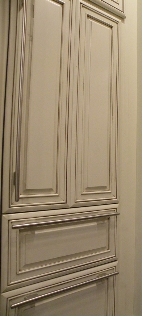
Here is a refrigerator and freezer built into the cabinetry. I do love this look, I have to admit.


And, speaking of cabinetry. This weekend was basically D-Day when it came to painting my kitchen cabinets. After months of dithering and questioning myself - do I want black or green kitchen cabinets. Guess what I've decided on?

I decided on a very dark, nearly black, green. Once I started painting my cabinet insides with Farrow & Ball Cooking Apple Green it just felt right to go with a deep, dark green exterior. So, I headed off to the paint store and selected two possibilities - Ben Moore's Black Forest Green or Essex Green. These are part of their exterior trim line and should (hopefully!) be very durable for a kitchen cabinet.


Black Forest Green


Essex Green

Now, clearly these two colors are very close and this is where we start questioning ourselves. While I'd been planning on going black all along (after a short detour towards lighter green), I got chicken committing to the Black Forest Green, so ordered a quart of the Essex Green in semi-gloss. I got it home and opened the can and pretty much knew that there was too much green and too little black.  So, I started painting some of the cabinet box exteriors (we took all the doors off last week). And yes, as I feared, too green. Ah, what's a girl to do. Well, first, I texted Rob to find out what time he was going to be here today and then to tell him about the color. And then I decided to see what he thought and moved on to cleaning and de-glossing all the cabinet doors. That was a fun Saturday night...

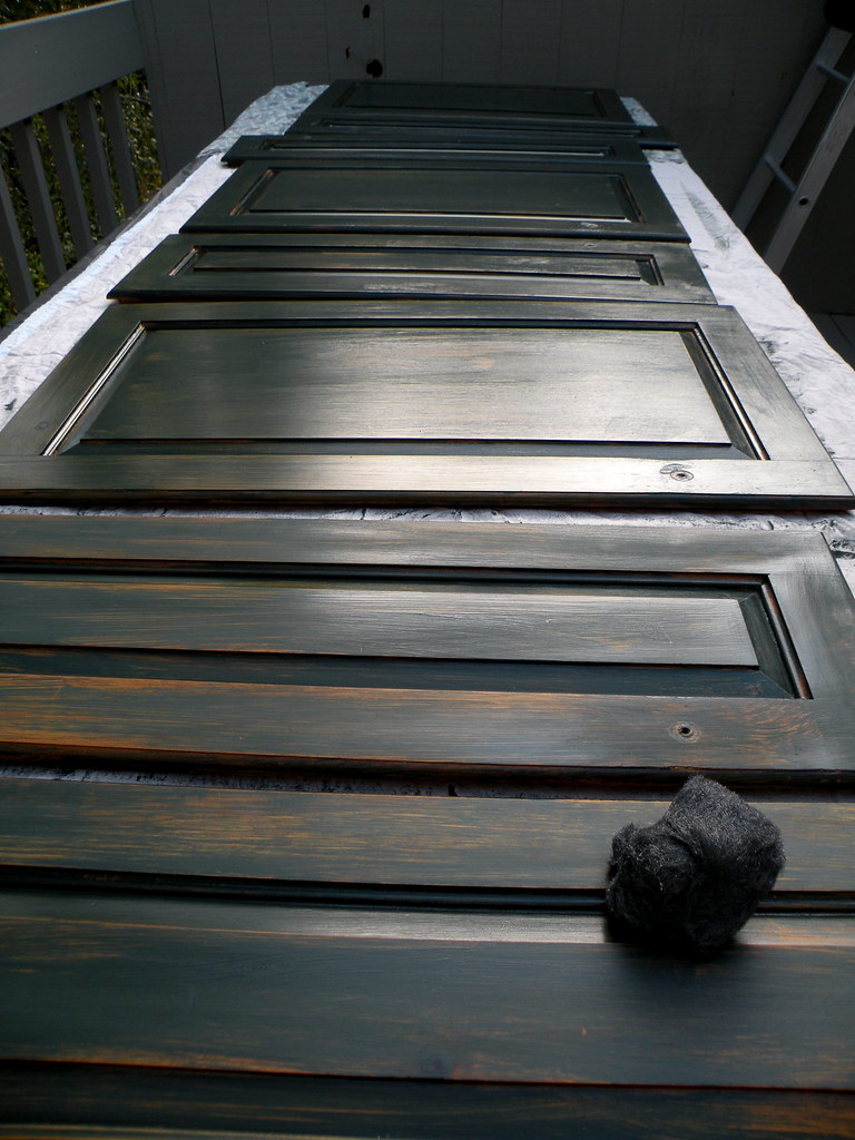
So, today, in the light of day, the Essex Green was still significantly too green, but I decided to use it as a base coat for the cabinets and use the Black Forest Green as the top coat. It's my own personal formula. Well, it's an experiment.


Here's the lineup on cabinet doors on my deck with one coat of the Essex Green. I want a slightly aged look, although not too "shabby country". Once the paint was mostly dry, I sanded down the sheen with a fine steel wool, which also pulled off some of the paint. Next step will be a coat of the Black Forest. I'll then see how it's looking. I am thinking of a final step of waxing the cabinets.

On other fronts, we primed and painted the entire insides of the cabinets, both uppers and lowers today. A second coat is needed on the uppers and then the cabinet exteriors can be painted the dark green.


These home improvement projects really get me thinking about my dear Daddy.  As I wrote about him a couple of years ago on Father's Day, my Dad was the ultimate DIY guy. Growing up, I knew there were carpenters, electricians, painters and plumbers out in the world,  I'd just never met any because Dad did it all. So, when I tackle a multi-part project such as this kitchen makeover, I really miss him terribly. He would have loved this project and every time I think about cutting a corner, he's whispering in my ear - do it right! So, as I was ruining my manicure sanding my cabinets today, I knew that I was doing as I am told. And the end result will be better for it.


 Subscribe to ::Surroundings::


  • Digg
  • Del.icio.us
  • StumbleUpon
  • Reddit
  • RSS

Don't ya love when you find something great - in your own cupboard!

One of the benefits of a kitchen makeover (aside from how it will look when it's all finished!) is that it forces you to totally clean out the cabinets. I actually found a can of refried beans that had a sell-by date of 1999. Gross, I know. The really weird thing is that I moved to my condo that year and had moved the beans with me!! Expired beans and I paid to move them. On the other end of the spectrum, however, is that I also found this fabulous tea pot that I'd totally forgotten about. How beautiful is this! My recollection is that I inherited it from my great Aunt when we cleaned out her house after she passed away many years ago - something like 20 years ago.  My Auntie Marion had lived in her home, a two-family in Arlington, MA since the 1920's when my Great Grandparnts bought it. The downstairs apartment was my mother's first home (my Great Aunt was my Grandfather's sister) and my Auntie lived upstairs until her death at the age of 87. I've inherited several beautiful items from the house that all date to the 1920's and earlier. Apparently, this little tea pot is no exception!


The mark on the bottom shows that this is from the Hall's Tea Pot company and was made in the USA.


This ad dates to 1921.


And this ad is late 1920's actually looks like my tea pot!


I can attest that I had a pot of tea this morning and it did indeed stay very hot, it does look good, and if the maid is careless, I am certain it will stand up to my her clumsiness!


A 1920's Trade Ad. This pot is the "French" shape and has the same floral pattern as mine.


Teapot shape names:
Top: French, Boston, New York, Baltimore, Philadelphia, Boston
Middle: French, Aladdin, Hook Cover, Los Angeles, New York, Windshield
Bottom: Hook Cover, Hollywood, Boston, Windshield, Aladdin, Parade


This is an ad from the 1950's. There's my little pot in the upper left!


A vintage promotional shot of the Hall gold decorated tea pots. Mine is upper right. 


Hall China is still in production in Ohio. A very big thanks to the Ohio Pottery Company for all the great information and images above.

Have a cuppa with me?


 Subscribe to ::Surroundings::


  • Digg
  • Del.icio.us
  • StumbleUpon
  • Reddit
  • RSS

Linda's Kitchen: Inside the cabinets


As I shared last week, we have removed all the cabinet doors and all the hardware from cabinets and doors to prepare the cabinets for painting. We got one set of cabinets primed and this week, while I was supposed to be continuing the priming job, I decided to try out the paint color that I've selected, which is Farrow & Ball's Cooking Apple Green.


Isn't it pretty? My absolute favorite color, ever! And I'm putting inside the cabinets. Oh, and on the ceiling. My kitchen cabinets are not, as I've mentioned, very high end, to say the least. They're a combination of nasty knotty pine on the outside with paneled back walls, and particle board side walls and shelves. Hard to paint, but I think two coats of primer followed by two coats of paint will cover it up well enough.

I decided to upholster the particle board shelves with burlap, rather than paint. My thinking is that it will be quicker and easier. Oh, truly, it's not quite as quick as I'd thought, I only got three done today. But still definitely quicker than painting several coats of paint!!!


And so, before I've finished actually priming and painting, I'm already putting in the covered shelves and styling... See what happens when a decorator is left to her own devices in a DIY project? We get distracted by the pretty!

My volunteer staff, aka my pal Rob, had today off. He's turning into a slacker as that's twice in one month!! Really, I am just kidding. I could not do this without his kind help, giving up part of nearly every weekend for the past almost two months.   I finally got him to pose for a photograph. Here he is in his own kitchen at his weekend house on Cape Cod. I was shooting his house for a story I'm writing on it. He's totally my Ty Pennington!

So, this is a pretty exciting week in the kitchen saga (nearly two months, getting scarily close to saga range!!!). I am going to be picking out my new kitchen appliances!

I have mentioned before that my blog is now part of New England Home magazine's website. My kitchen makeover has become the focal point of this new partnership and I can now announce that the third party in this relationship is Ferguson, a kitchen, bath and building showroom.


I'll be visiting their showroom on Friday to work with them to select my new range/oven, range hood, dishwasher and refrigerator. So exciting! I'll have a blog post on that process next week. Very exciting!! Am beginning to hope that I'll have it done by Christmas!


 Subscribe to ::Surroundings::


  • Digg
  • Del.icio.us
  • StumbleUpon
  • Reddit
  • RSS

Linda's Kitchen: It's not pretty, but it's progress


A quick little weekend update on my kitchen makeover. I'm running around like a crazy, headless, chicken this week, but wanted to do a quick post on the kitchen.  This weekend, we removed all the cabinet doors and all the hardware from the cabinets. I would have just painted around the hardware, but my more responsible volunteer staff overruled my lazy self.

We also started priming the insides of the cabinets, as you can see. One of the issues is that some of the cabinet interior walls are wood and some are particle board - so naturally, the paint won't adhere the same to the two surfaces and the end results will look uneven. I had the idea of covering the particle board with beadboard wallpaper and then prime and paint everything. But, guess what, the wall paper does not stick to the particle board. All righty. So, we pulled it off, and by "we" I mean Mother Nature and Mr. Gravity made it come off all on its own, and we primed the entire insides with Zinsser primer/sealer. It may turn out that the particle board will look fine with just the primer coat (or two) and we won't have to paper at all. It's a work in progress.

So, that's where we stand. Oh, and the entire contents of my cabinets is strewn all over the dining room and in bags on the floor of the kitchen. Hello, take out? 

I wonder if Joni's Whataburger will deliver to New England?


 Subscribe to ::Surroundings::


  • Digg
  • Del.icio.us
  • StumbleUpon
  • Reddit
  • RSS

Linda's Kitchen: Let there be light and contemplating copper

Another Sunday and some more progress on my kitchen makeover!  My volunteer staff (a.k.a. close pal Rob) was all rested from his weekend away in NYC last weekend where he took in The Marriage of Figaro at the Met and Jude Law in Hamlet. He said Figaro was excellent and Jude Law was amazing as Hamlet. So, a little arts news for those interested!

This week, we FINALLY installed the recessed lighting! I was very excited!  Bright lights always make things better. Well, until I got a hold of what was going on in between the refrigerator and the cabinets...oy. Scary, to say the least.

So, here we are in progress, wires coming and going. And camera shy Rob who didn't want his pic taken. So we have a shoulder. I told him I wanted him to be my Ty Pennington and develop a fan base all on his own, but he didn't go for it. I told him he's every bit as good looking as Ty, maybe just not quite as thin. He suggested that if I put his pic in without his baseball cap (like that's really hiding something!), he'd take my pic in my work clothes, sans makeup. Yup, yup, nnnnope. So, take my word for it, he's every bit as good looking as Ty, maybe just in a slightly more middle aged, balding and softer way. My bff girl friend  is lobbying for him to start wearing a toolbelt, preferably in a kilt... but I digress.


And, voila, the lights are in!!! So pretty. You can see I've emptied the cabinets and removed the shelves to start prepping for painting the insides. (Forgive the trashbag that wasn't as out of the way as I'd hoped!) I now have dishes and glassware stored all over the place. Because, as I reported last week, my dishwasher is on the fritz, and it does make a good draining rack/storage space. My wine and champagne glasses are spread all over my dining room and most of my dishes and silver are on the bakers rack. Food is in bags or in the fridge.


A little note about the silly little window treatment, in case anyone was wondered what the heck I was thinking. I have had a black and cream toile roman shade up for years. Early in the summer, I took it down, thinking I was going to have it cleaned, or copy it to make a new one. I had a little idea about a blog post on making a cute little window valance in 30 minutes for under $10.  It's made from two dishtowels, sewn together. It didn't come out as cute as I'd envisioned, so I never did the post. But, it was pretty pink, so I figured I'd leave it up for the summer. The kitchen makeover grew and grew over the summer, so I've left it up as I'm going to be making a new roman shade once the kitchen is finished.  So, that's the scoop on my little 5th grade level sewing project!

So next up with the kitchen is that I am going to be papering and painting the insides of the cabinets and upholstering the shelves, since they are particle board and I don't want to paint them.  Then, we'll be painting the exteriors of the cabinets and putting on new hardware. The interiors are going to be off white (the same color the the bead board walls and moldings will be) and the exteriors are going to be black, with a little antiquing. So, of course, with all that work coming, I'm starting to ponder the decorative accessories. I have a small collection of copper - some molds, cookie cutters, watering cans and my pans are copper bottomed Revereware. Copper is coming back into vogue, so I might as well make use of what I have!

Here are a few inspiration images that I've gathered:


My love of copper can be pinned on my 2002 visit to the kitchen at the  Chateau de Chenonceau in France. Love the rope banister that leads down to the stone kitchen. And, those copper pots on the walls are enormous

Here's Martha Stewart'sTurkey Hill kitchen post- renovation.


And here was Martha's original kitchen at Turkey Hill


Unfortunately, I've lost the source of this image, so if anyone knows, please let me know.
Update: This is Martha's kitchen (out in the stable) at her Bedford home. Thanks to Deborah of Boxwood Terrace for letting me know, and, of course, to Eddie Ross, who also decorated this space!


And here is Eddie Ross' copper collection in the new Lonny magazine via EddieRoss.com


Eugenie-La-Bains kitchen via EddieRoss.com  I just love the symmetry of the placement of copper pans.


And, of course, Mrs. Julia Child's Kitchen in Cambridge, MA


And another amazing collection via Bluelines

And so, I still have a long way to go before I can be accessorizing, but it's much more enjoyable contemplating copper than planning to paint!

(image at top, an antique Swedish tea pot, is courtesy of Avolli).


 Subscribe to ::Surroundings::


  • Digg
  • Del.icio.us
  • StumbleUpon
  • Reddit
  • RSS

TopOfBlogs My Ping in TotalPing.com iPing-it Add to Feedage RSS Alerts Add To Fwicki Add to Spoken to You
Preview on Feedage: interior-design-minimalis Add to My Yahoo! Add to Google! Add to AOL! Add to MSN
Subscribe in NewsGator Online Add to Netvibes Subscribe in Pakeflakes Subscribe in Bloglines Add to Alesti RSS Reader
Add to Feedage.com Groups Add to Windows Live
Feedage Grade B rated