The color in the interior of the home plays a significant role in art. It participates actively in the architectural composition of housing design. The same room may vazdeystvuva in different ways depending on its color.

Psychologists have found that addiction to certain colors depends primarily on gender and age. In the lives of women colors play a much greater role than in men. Women love more warm and bright colors, and men - in the cold colors and color with less brightness.
* Modern science proves ergonomics and clarifies the role of color in our lives.

The choice of colors for different rooms can not be done arbitrarily only for one color we like. Color composition of the interior be considered in advance, by proceeding from the purpose of the premises of their size and exhibition. In all cases must choose one color to be essential for other non-ferrous objects entering the composition of the interior (furniture, fabrics, utensils, pictures, etc.). The main color should be gospodstvasht but quantity as occupying most of the room, and quality - as contrasted by its brightness. The color of the walls, which represents the background for the furniture, pictures, tissues and even the people who inhabited dwelling must be sustainable and as soon as possible, neutral, to enable him to tone color all elements of the interior. Everything form the background, must less intensity by choosing the color passive.

* Besides the function of the premises and personal preference in choosing colors must take into account the location of the premises themselves.
o In areas where sunlight is scarce are appropriate warmth, in south-eastern and southern areas - cold colors. To achieve colorful effect, apply the principle of reverse correlation between the size in the brightness of the color spot. For walls with large surfaces apply bright colors, but for small objects (ceramic products, small decorative fabrics) applied intense and dark colors, and sometimes more vivid.
o In rooms designed for the exercise of the profession and for learning, the colors of the walls of the furniture to create an atmosphere of calm and business. For this purpose, suitable neutral colors range from green, sage, slate-blue and other colors of yellow razsvetlenite range of colors.
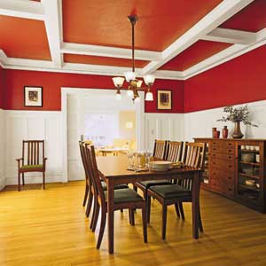
In rooms designed for rest, cultural activities, etc.., Not very intense match colors like green, blue and beige.
o In the bedrooms premises color dynamics should not be active. Walls they are painted in pastel colors with sivobiserni, and light pink shades. The impact of color in the bedroom should be relaxing and neutral.
o The colors in the nursery in principle should be different from that of other premises. Its impact must be active, to propitiate bodro and happy mood. Relevant to the average color saturation, but also with greater intensity. For children under school age and primary classes are recommended yellow, orange, svetlochervenite, crimson, morskosinite light and colors. This rule applies as those colors are more vivid and strong, so colored surface must be less. Walls, floor, ceiling with all furniture and must create an active ensemble, which affects the psychological and physiological status of children.
* Bikolorizmat (dvutsvetieto) must be used wisely. Drawing of different geometric shapes and pictures on the walls should be avoided because these improvisations rarely may have some artistic value. The ceiling is colored in bright tones, and floor - in the dark. Between floor and walls should have a strong contrast in color, and between the ceiling and walls less.

* In the kitchen color solution may be the most diverse. Walls, which are kitchen appliances, may be colored in orange and the other walls - with light.
The walls in the kitchen with gray walls and the other required to otsvetyat with white color and facial parts of the furniture - fairness. The floor is warm in color. If all the walls are light color, the front of the furniture is advisable to be colored in gray and blue in the floor or galabovosiv color. If all walls are painted with light color, facial parts of the kitchen furniture should be light colored with a floor to be warm white color.
If the walls and furniture are painted with light color, the floor should be activated otsveti warm color. If the walls and furniture are painted with white color, the floor is required to otsveti example dark green color, etc.
![]()
* Use proper harmonious combination of colors can be selected many variations of color background to avoid some errors and color to create such an atmosphere that suggests elation.
Lucky color combination in our home is set more colors and fabrics, lamps, paintings and a number of small and decorative items.
* Color design of an area must choose one primary color, which will give tons and can say the nature of the premises. This primary should dominate over kontrastnite.
* Color accents in the home are needed - they reinforce the impact of basic colors and interior alive.
There are the following principles of color design of the interior.
o Large surfaces - walls and ceilings are colored in unsaturated bright tones
o a small stain (fabrics and furniture) - in saturated colors;
o bright colors should occupy less space;
o be a rotation of warm and cold colors, such as use full color contrast;
o to avoid the variety of bright colors that create unrest.
* As the dominant influence on the color design of housing have furniture right to know that if the bedroom furniture are arranged with a veneer (ash, maple, maple and other poultry.) Must emphasize the effect of the tree, it the walls are colored in toplozelenata range covers the bed can be a color of gold, green or ocher and postelkite floor - in the range of brown colors. If the bedroom is dark veneer, it is colored walls to bledosinyosivo covers to be saturated red or orange, and flooring - blue. Bedroom, with furniture arranged, veneered with walnut veneer, combined with appropriate straw-colored walls, covers the green color and beige floor coverings (carpets, carpet, rug, etc.).
* In the daily color dynamics is more pronounced, such as furniture with a veneer furniture fabric suits in sage tones and kilimat or floor - with tan. If the furniture of daily are walnut, the furniture fabrics should be red wine or a tinge of brown, the walls are colored in ocher and floor - in dark blue or beige.
* In the nursery stolchetata, dining tables and beds can be colored with saturated tones of red, yellow or green color. Are appropriate combinations with white.
* Given that bright tones create optical fraud for space, small apartments and rooms need to be built in relation with the light tone colors, and shall be no fragmentation of individual areas and groups.
* At Large apartments can be used more intense colors as a goal should be to avoid monotony.
Modern residential interior architecture enables separation of the premises of individual spots, each of which performs a specific role. These parts of the room can be distinguished by applying different colors - for example, in a dark color tones on the other walls or by a combination of different types of structure and wall coverings. Sometimes the colors of the walls in different rooms deliberately made different, to connect in the color of the different groups furniture. In those decisions apply quiet colors to avoid the impression of variegation.
In some cases, the interior of the home in terms of color and design will be pretrupva with random colors. It is the creation of each element required for the arrangement of the house, prior to consider its color layout.
- Traditional Interior Bathroom Design
- Zebra Patterns - Traditional Interior Design
- Interior Design Trends and Materials
- Lounge Chairs - Armchairs
- Amazing Beuth Residence on Blue Jay Way
- Beautiful 35 mp One Room Apartment with Kitchen
- Contemporary Design in Central Goteborg
- Bedroom Designs and Room Ideas for Modern Teens
- Ideas for a modern house
- Living Room Spaces : Pictures and Ideas for Your Home
- The Modern Kitchen with Sliding Cabinet Doors
- The weirdest hotel rooms ever
- Competition Line of Site - Dream to Create
- How to determine your own style of furniture?
- Quick refreshment around the house - Ideas for home
- The impact of colors - Color Effects - Interior Colors
- Kitchen cabinets furniture and equipment
- Cheap and practical ideas on home decoration
- How to arrange the children's room?
- The colors in interior design - Style and Passion


